Atomizer


Date: March 23, 2011
Source: http://s3.amazonaws.com/data.tumblr.com/tumblr_ljm7mslVGI1qj33foo1_1280.jpg?AWSAccessKeyId=AKIAJ6IHWSU3BX3X7X3Q&Expires=1303172030&Signature=dcv36u8KFfpGJe8CJv0mXa3dOFA%3D
Critique: I find this very intriguing. The black and white makes it very dramatic and adds to the depth of the image. Everytime I look at it I try to figure out what it is made of, or what it is supposed to be. I always see either some type of flower or an abstract shape of some sort. Either way, I love it. The typography, I feel, is done very well too. It is the only white area in the image.

Album


Date: March 22, 2011
Source: http://s3.amazonaws.com/data.tumblr.com/tumblr_ljm7p3eMsd1qj33foo1_1280.jpg?AWSAccessKeyId=AKIAJ6IHWSU3BX3X7X3Q&Expires=1303171940&Signature=rN9TqDmpSWlVwr6ZXTkVX1neL8I%3D
Critique: I like the overall monochromatic pallet along with the repetition of horizontal lines and the random type alignment.

Poster


Date: March 21, 2011
Source: http://s3.amazonaws.com/data.tumblr.com/tumblr_ljm9toHuI41qj33foo1_1280.jpg?AWSAccessKeyId=AKIAJ6IHWSU3BX3X7X3Q&Expires=1303171809&Signature=71ISwrudml2MMwYuwIn5wFbI2SA%3D
Critique: I absolutely love the shapes and flow of this. I don’t know what more to say other than it is amazing.

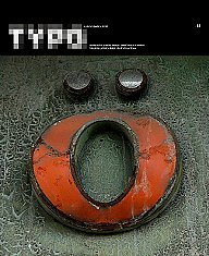
:o


Date: March 21, 2011
Source: http://29.media.tumblr.com/tumblr_ljma2lJPSQ1qj33foo1_250.jpg
Critique: This is a cover for a type magazine. I thought it was pretty awesome. I like the idea of making things out of letters - looking at things in a different way than you normally do.

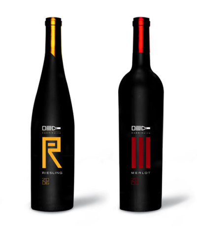
Wine Package


Date: March 21, 2011
Source: http://26.media.tumblr.com/tumblr_ljma3x7gA91qj33foo1_400.jpg
Critique: I love this product design for the wine. I find it’s a very simple, clean, creative way to have the different designs for each type of wine. I love it.

Malibu Rum


Date: March 20, 2011
Source: http://www.htinspires.com/ht_designs/2008/11/malibu-rum-embraces-pop-street-art.html
Critique: An artist designed a series of Malibu Rum. I thought it was pretty neat. I like the space for the bottle - very effective way to add the required text and logo

Wine


Date: March 18, 2011
Source: http://contentinacottage.blogspot.com/2008/11/wine-for-thanksgiving-day.html
Critique: The design stuck in my brain so much from the moment I saw it. I love the simplicity of it and how once you see the turkey in the fork, it’s just amazing.

DOO


Date: March 15, 2011
Source: http://lovelypackage.com/doo-smoothie/
Critique: Another product design I really like. I like just how simple and clean it is. I also like how its’ consistent for each flavour, but very effectively makes it obvious which flavour is which.

Business Card


Date: March 17, 2011
Source: http://www.cardonizer.com/business_cards/paul_nielsen
Critique: This is a pretty creative/neat business ‘card’. Just so cool. People will definitely remember you if you gave them this - and that is just what the point is.

Casino Royale


Date: March 14, 2011
Source: http://www.dipity.com/timeline/Casino-Royale/
Critique: Casino Royale’s intro is really amazing too. I find it has a similar Saul Bass feel, but continues with a style James Bond movies have always had. I really love their use of the suits to go along with the casino theme. Very very well done, another one of my favourite movie intros.

Damaged


Date: March 15, 2011
Source: http://www.12thpress.com/?m=200810&paged=2
Critique: This is a photograph Brian Maloney had in his presentation that was at the TDC show at Humber North first semester. Since I’ve studied photography, and of course love photography, it stuck in my mind. I love this photograph so much. It is so well composed, the typography of it. A possibly damaged sign that says damaged. I just love it.

Inside the Box


Date: March 14, 2011
Source: http://www.flickr.com/photos/wordboner/4500601439/
Critique: I’ve always liked this. I like how it plays on the cliche ‘think outside the box’. The main thing I don’t like, though, is how the type isn’t the same size. Mind you, it does help give the coffin shape. I find the simplicity of it is good as well - monochromatic, simple shapes, etc. Just helps strengthen the message.

White Space


Date: March 12, 2011
Source: http://alanajoy.tumblr.com/post/3688743387/white-space-makes-me-happy
Critique: I liked this because of how we are taught that white space is good, often our friend. We need to have white space, breathing room, in our designs. I thought this photo was a good example of that.

Look Everywhere


Date: March 14, 2011
Source: http://www.grafikwar.com/look/pdf/LOOK4.pdf
Critique: “Look everywhere you go. There’s always something on your side”

I like that as a quote. I love this because I love photography and type. The photographic images are well done - simple scenery. I like the basic shapes made to spell out look - how it implies to just look, see the world. The basic quarter grid of the sheet goes well with the four letter word.

Small Island


Date: March 11, 2011
Source: http://geekiest.net/beautifulmails/post/Cool-Conceptual-Photography-Ideas.aspx
Critique: I really like how they used a simple robe to create this piece. It is very simple, and there is not much going on, but it was one of the few photographs that caught my attention while surfing through this website.

8 ball


Date: Mach 8, 2011
Source: http://top-lists.info/top-25-outstanding-examples-of-conceptual-photography
Critique: I found this on a website of conceptual photography. I do not only like the simpolicity and high contrast of it, as well as the water splash created by the thrown ball but also the message beind the photograph. I do not exaclty know the intended meaning of the photographer but to me it means that people shouldnt let their lives depend on just luck. We gotta work hard for what we want in life, otherwise, we will drown.

Smoking


Date: March 6, 2011
Source: http://www.blogymate.com/post.aspx?BlogID=1868&t=Conceptual-Photography
Critique: I really like the message of this photograph. It is very simple yet striking. It truly emphasizes the dangers of smoking and the effects that will happen after a long run. Im surit will stop many people and make them think about it for a while.

Conceptual Photography


Date: March 6, 2011
Source: http://obviousmag.org/en/archives/2009/02/misha_gordin_-_conceptual_photography.html
Critique: I really like the smplicity an miimalism of this photograph. The
shapes, harsh contrasts, and rigorous compositions capture the meaning of the photograph very effectivately.

I want...


Date: March 6, 2011
Source: http://cloud-9.tumblr.com/post/580802202/9gag-i-want-to-eat-you-baby-translation-or
Critique: I thought this was pretty cool. Again makes you start thinking about what you can make out of ordinary/every day things.

Juice Box


Date: March 5, 2011
Source:http://sparkleshock.wordpress.com/2010/02/16/
Critique: These are juice boxes made to be like the fruit skin for the type of juice. I love this ingenious design.

Barcodes


Date: March 4, 2011
Source: http://thebottomdrawer.posterous.com/barcode-art-great-examples-of-creative-use-of
Critique:I’ve always wondered about ways to creatively use barcodes for products, etc. I stumbled upon this and I love these different ways to incorporate a barcode! Very creative/neat ideas and still allowing the barcode to be readable.

Catch Me If You Can


Date: March 4, 2011
Source: http://falulatonks.tumblr.com/post/2431453024/catch-me-if-you-can-2002-dir-steven-speilberg
Critique:I absolutely love the movie intro for Catch Me If You Can. It’s not only a great movie, but amazing intro. The typography, design, and animation is just fantastic. The intro is very ‘Saul Bass’, which I love all of his stuff.

Lets Start Collection


Date: March 3,2011
Source: http://idsgn.org/posts/award-winning-print-design-from-cannes-lions-2009/
Critique: This is a business card for Glammer Education Institute of Hair Design by Y&R Thailand. The card allows for shapes to be cut out with scissors, creating unique hair styles. Without even entering the program, people can already feel like they can do just about at anything at the beginning level. It is very creative and innovative, it will sure catch peoples attention.

Designing Naturally


Date: March 3,2011
Source: http://idsgn.org/posts/award-winning-print-design-from-cannes-lions-2009/
Critique: This is a flyer for a workshop printed on leaves in brazil. Most people throw at flyers on the ground, as a result the deigner of this piece decided to do the printson leaves, which are sent out and returned to nature once they are thrown out. Its a great way to both call people in to the workshop andprotect nature.

Personal Trainer Shirt


Date: March 3, 2011
Source: http://idsgn.org/posts/award-winning-print-design-from-cannes-lions-2009/
Critique: This shirt shows the amount of time someone has trained depending on the amount of sweat that is left on the t-shirt. I think it is quite successful and it will give trainers the chance to see their progress and how much workout they are geting each day. It is a self motivator for people.Personally i dont like to see anyone soaking wet after a workout but with this idea it works quite well.

Rain Changes Everything


Date: March 3, 2011
Source: http://idsgn.org/posts/award-winning-print-design-from-cannes-lions-2009/
Critique: This is a billboard that bleeds when it rains. It was created to show that heavey rains bring the highest death toll in New Zealand. To alert people of the dangers of driving in the wet, the billboards that bleed everytime it rains were created. I think this reinforces the idea very well and it truly catches peoples attention especially if they get to see it on both sunny skies and rainy days. People will definately drive with more caution and be aware of the dangers wet streets may bring.

Tamiya Business Card


Date: March 2,2011
source: http://idsgn.org/posts/award-winning-print-design-from-cannes-lions-2010/
Critique: This is avery unique business card for the Tamiya model kit shop in Thailand. The business card itself acts as a sample modeling kit for the brand. The concept is very powerful and its something that would be on everyones mouth for its design and success. Many shop enthusiasts would probably go and buy the business card right away, break down the pieces and play with them to create something new themselves.

Mars Message Package


Date:March 2, 2011
Source:http://idsgn.org/posts/award-winning-print-design-from-cannes-lions-2010/
Critique: This blank canvas Mars bar wrapper gives the opportunity to young people to have some fun with the ionic brand and give the package their own design and message to give it to friends or family. Its very interactive and very creative and it would create grand brand awareness.

Cutter Art of Olfa


Date:Marc 2,2011
Source:http://idsgn.org/posts/award-winning-print-design-from-cannes-lions-2010/
Critique:The designer of this packaging transformed paper into artwork used in avertising and ppackaging for the company to emphasize the many uses of the product. The detailed and repeated patterns succeed in getting people invloved in the poster. The perspective, density and scale were shot in a very nice manner.

Candle Projector


Date:March 2,2011
Source:http://idsgn.org/posts/award-winning-print-design-from-cannes-lions-2010/
Critique: This is an invitation for the Vivo Brazilian Movie Awards. It folds up to be a candle-lit film projector. I tink it is very creative and innovative which realates to the event very well. The movements of the candle flame gives the feeling of an old film projection. Anyone who got this invitation would probably want to attend the event with no hesitation. I really like it.

Verbal Abuse


Date: February 24, 2011
Source: http://www.1stwebdesigner.com/inspiration/creative-smart-advertisements/
Critique: I really like this ad, i think the image is very strong and its very creative. It really shows how verbal abuse can be as harsh as physical abuse and can harm anybody. I love the concept.

Help Yourself


Date: February 24, 2011
Source: http://www.1stwebdesigner.com/inspiration/creative-smart-advertisements/
Critique: I find this very simple. I dont really like the design somuh but i love the concept. Whitout any explanation or words it really gets the idea across. I couldnt think of a creative way to demonstrate that theres no one who will help you better that your own self.

who will feed them if you dont?


Date: february 24, 2011
Source: http://www.1stwebdesigner.com/inspiration/creative-smart-advertisements/
Critique: Im not really sure which company was advertising this. When i saw it i found it to be very emotional. It realy makes you think about all the poverty around the world and the many people that go days without eating while some of us throw away food on a daily basis. I like the idea of this advertisemnt, and i think it was very succesful.

Burger King


Date: February 25, 2011
Source:http://www.1stwebdesigner.com/inspiration/creative-smart-advertisements/
Critique: I think this ad is very successful becaus it emphasizes how big Burger King's big mac is. It uses humour to get the message across and its very successful. I realy like the concept.

Mini Cooper


Date: February 24, 2011
Source: http://www.hongkiat.com/blog/70-creative-advertisements-that-makes-you-look-twice/
Critique: This advertisements is very creative. There arent any words to describe what is happening. Everything is visual and it works really well. Sometimes exaggerations are the best way to get an idea across. This one of course, worked really well. It shows how small it is compared to other cars.

Clorets


Date: February 24, 2011
Source: http://www.hongkiat.com/blog/70-creative-advertisements-that-makes-you-look-twice/
Critique: Ireally like the concept of this advertisement. Its very simple and it doesnt have any elements. However, its perfect to get the idea across. There is nothing better than clorets to kill fishy breath.

Nothing can Replace a Tree


Date: February 24, 2011
Source: http://www.hongkiat.com/blog/70-creative-advertisements-that-makes-you-look-twice/
Critique: Once again, i love the concept and idea of this ad. It raises awareness about environmental issues and about how humans are destroying nature. This is a creative way to make usunderstand the problem and encourage us to do something and protect nature, recycle, and not kill trees.

FedEx office products


Date: February 22, 2011
Source: http://www.hongkiat.com/blog/70-creative-advertisements-that-makes-you-look-twice/
Critique: When i was scrolling down the page, this photo got my attention. I love the creativity on this piece. If i was the one walking down the street and saw this, i would for sure remember it and go buy at Kinkos. There is no way i can walk by ihout noticing i. They wanted to create brand awareness and they sure did. I love the idea, its very innovative and it works really well.

Mother Earth


Date: February 23, 2011
Source: http://web2box.blogspot.com/2008/12/advertising-creative.html
Critique: I like the idea of the poster. Its a rally good way to aware people about the environmental issues that we are having the moment, and it encourages society to do so something four our earth so that it wont "melt" and be completely destroyed.

"Default"


Date: February 22, 2011
Source: http://devisefunction.com/2010/03/25/40-beautiful-creative-poster-designs-for-your-inspiration/
Critique: I found this piece and it really reminded me of all the classes im taking rght now and how everyone keeps repating to go one step above, be creative, and do not use the default settings on anything we design. This isnt a great typographic work, but it remins me that not everything has to be centered and lined up for it to work. All the letters in this posters are stacked up and on top of each other, not organized, but thats what design is all about.

Knives


Date: February 22, 2011
Source: http://adsoftheworld.com/media/print/wmf_knives_cutting_board
Critique: I like the concept of the work. The image is very simple but it gets the idea across about the knife being so sharp. Personally i wouldnt have made so many cuts but i love the concept anyway. Sometimes exaggerations are the way to go.

Door "Hand-le"


Date: February 22, 2011
Source: http://www.likecool.com/brand-Home-Design-4.html
Critique: Ive taken a look at various forms of design. I got to architecture and interior design and i found this photo. I found it to be very amuzing and creative. I would totally go and open any door just because it has that handle. Anything that is not the "usual" truly catches attention.

A Tiny Apartment Transforms into 24 Rooms


Date: February 21, 2011
Source: http://www.youtube.com/watch?v=Lg9qnWg9kak&feature=player_embedded
Critique: In Hong Kong, because of the space, apartments are small and expensive. Gary Chang, an architect, decided to design a 344 sq. ft. apartment to be able to change into 24 different designs, all by just sliding panels and walls. He calls this the "Domestic Transformer." I love te work he did. I find ithard to believe that he was able to design so many rooms in such a small space. If i lived in place like that, i would be thrilled to have to have this design since its so modern and organized.

Dumbbell Sports Drink Packaging


Date: February 20, 2011
Source: http://www.toxel.com/inspiration/2009/04/04/20-unusual-and-creative-packaging-designs/
Critique: The Dumbbell Sports Drink was designed by Jin Le. I love this bottle design. The bottles can be filled with the water or any other drink after u drink it all up and it will weight 0.5 kg, so it is rady to use as dumbbells. Its a great concept. Its an energy drink and the bottle can be used for the work-out as well. Its very interactive and probably many people will actually give it a try.

Tequila Gun Packaging


Date: February 20,2011
Source: http://www.toxel.com/inspiration/2009/04/04/20-unusual-and-creative-packaging-designs/
Critique: Compared to the regular tequila bottle, i think this packagig is very creative and it brings out that mexican feel. Every time i think of tequila im reminded of the duels from way back, and this packaging really relates to the theme. I think its a great design, and it does the job.

Reebok Packaging


Date: February 20, 2011
Source: http://adsoftheworld.com/media/ambient/reebok_exta_grip_packaging?size=_original
Critique: This is a creative packaging idea for Reebok climbing shoes. I really liked it, it goes very well with the concept. It really catches attention since its not the usual, boring box. It's very innovative and its very appropiate for the time of shoe that is being sold.

Typolution


Date: February 6,2011
Source: http://www.youtube.com/watch?v=zVPfTlpCKaw&feature=BF&list=QL&index=16
Critique:I find this video to bevery creative. I wouldnt have guessed that you could make clips such as this one with typograhic elements only. The composition works very well with the music and theme of the video. I eally like it. Compared to others that i previosly saw, i think this one was very well done.

Text Dancing


Date: February 5, 2011
Source: http://www.youtube.com/watch?v=ydOQRCr7odw&feature=BF&list=QL&index=1
Critique: This is very simple type animation but i really love how the particles are blow away. The movements is very real and smooth. I've taken a look at many after effects on type and they are very interesting and creative.

Colors are Vital


Date: February 2, 2011
Source: http://www.creativedepart.com/graphic_design/airgroom/
Critique: Like the title says, colors are vital. This piece wouldnt work the same if it were, for example, in black and white. I love the strenght of the colors and how they stand out from the background. This piece has movement and rythm. It makes me thing of house-electro music for some reason. I guess its the flow and the vibe of the work.

Harmony


Date: February 1, 2011
Source: http://www.peteharrison.com/home/my-portfolio-view-my-work.php
Critique: I really like this type of digital work. There were many different pieces on the website and i couldnt just stick to one. They all show the same motion and flow in the lines and floing objects. I like the composition of this piece and the movment. I love the structure and texture of the body and how it works as a puzzle and starts to fall apart. There ar many details in the work that make the entire composition stand out and be appealing to the eye. Like the title, this piece works in harmony.

Aeiko


Date: January 29,2011
Source: http://www.creativedepart.com/graphic_design/aeiko/
Critique: I love this typographic work. I really like the colors against the black background and i also like the flow and movement of the type. Its very playful and energetic.

Jen Stark


Date: January 28, 2011
Source: http://www.creativedepart.com/art/jen-stark/
Critique: Jen Sterk's work is very unusual ad creative. She uses paper to make sculptures, movies, and photographs. I love this picture in special because it looks very abstract, which i like. Its grea how she uses simple media to create great, colourful pieces of art.

Doritos Packaging


Date: January 26,2011
Source: http://www.creativedepart.com/typography/doritos-packaging-concept/
Critique: I love the concept of thi package. i think the idea of makin the triangular shapes go in accordance to the product. It is very innovative an i think it would work really well in the market. It will stand out from the other products for sure.